Aaron Cael

Category: howsyourwritinglife

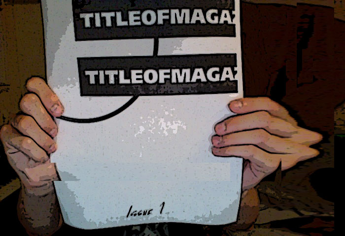
TITLE #1 is Done and I’m Filthy and Sweaty

holdingcover

Some reflections on finally getting the print issue of TITLE done…

  • Holy sweet tapdancing Batman is the devil in the details. The little things that can be obsessed on. Conforming fonts, margins, bleeds, getting the goddamn thing to actually print out in the proper folded booklet format… wow, I better do this a lot so I get permanently good at it and can actually set things up in advance. I would love to have a basic fluency in InDesign and not have to stop, Google up an answer, then try to regroup.


  • When in doubt, make a game. I had two pages I was not in love with so I nuked them and started over. confronted with two blank pages facing each other, I asked myself: what’s missing? Something to interact with. Some kind of tool or experience or instruction or activity. So I made a board game.  Game design has long been something I’ve been interested in. Purely megalomaniacal reasons. For however long the game takes, you have people following your rules, thinking, moving, interacting in ways that you designed. Bwahahahaha! But like any dictator, your rule only has worth as long as you get people to do what you say so the game rules are shaped by a need to create a pleasurable, interesting experience. For this one, the main restriction was that all I had to work with was ink on a page. Any other equipment or setting had to be easily obtained by the player. So no spinners, cards, complex physical interaction or blindfolds. So… a board game. With trivia elements. Dice? Might be too much to ask. I suggested throwing four coins and counting how many turned up as heads.


  • Collaborating on design is hard for me. I have about a half dozen close friends who are better/more professional than me at graphic design, layout, InDesign, etc. I tried working with a few of them but… can’t. It became three times the work arguing over fonts and minutia, in different professional languages. Better to crash course it or strictly define what areas are handled by whom. I can’t do design as a jam session.

Most of all, I’m excited to finally print this and start sneaking it into strangers’ hands. Should entail some kind of rethink of titleofmagazine.com as well. What the hell should that be if not a blog?
Character scavenging

image

The guy across from me on the train is middle-aged, white, and wearing a cream colored Members Only jacket. A pristine Vancouver 2010 USA Olympic Rowing baseball cap and big black work boots scuffed to dark green. He’s also intently fondling a big pile of plastic gold necklaces. The cheap beaded kind like you’d get at Mardi Gras for dramatic acts of public service.
The problem is, I can’t use him.
Writing fiction backs you into something of a corner when it comes to characters and events. You have to select images that establish the rules of the world you describe, staying within a certain boundary of plausibility, yes, but more importantly staying on message. So while the New York Metro area provides a wide variety of oddballs, desperadoes, schizophrenics, and weirdos of every stripe, that variety must be curated.
It becomes a matching game. What bizarre stranger best matches the mood of the part right before the breakup? If I’m setting up the feeling of desperation, who should I put in the background: the elderly black man in the boiler suit with the gold spray-painted briefcase dancing to his walkman or the white guy with gray Bozo hair who backstrokes across the floor, eyes squinted shut, in various public transportation hubs?
But gold beads… naw I can’t use it. Would be too cheap a metaphor for fruitless grubbing for wealth, too close to clutching a rosary, too random for anything else. The Members Only jacket and the boots combo, though. I might use that next time I’ve got a hot date.

Questions About Format

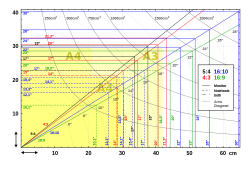
LCD_screen_sizes.svg

I keep getting stuck in thought loops on the subject of how format/medium shapes the reading experience and how to compromise that with the realities of time/effort/$$$ of creation.

– – –
Mostly:
Screen vs. Physical object
LCD vs e-ink
7″ vs 4″ vs 10″ vs Goddamn, no one’s going to try to read this on a Blackberry are they?
epub vs azw/mobi vs pdf vs invent your own, you fancy little man
– – –

And then all the considerations of size, binding, distribution method, and cost for a physical, probably paper, book, zine, or reading object. If I was dealing with a publisher to breeze my beautiful little thoughts out to the minds of the world, it’d be something I’d think about in an idealized way and then gripe about how my grim corporate overlords know nothing and screwed up my perfect vision. As that I’m DIY-ing, my options are wide, wide open but the money to do much just isn’t there.

For me, finding a format to work for a given piece of writing involves running through these questions:
1) How long is it?
2) Any pictures?
a) Do these pictures need to be precisely placed?
b) Do they require color?
3) Any videos/links/computer-specific things?
4) How vulnerable is the reading experience to distraction?
5) What are the relative merits of it being easily reproducible or carefully crafted?

Here’s something we did a few years ago that was especially shaped by Questions 1, 4, and 5. FU1K: Fiction Under 1000 words. A print and fold short story. A physical reading experience that was easy for the reader to print, transport, and have a distraction-free reading experience. More background on that here. I think I might try this again.

FU1K: Crescents
FU1K: Submarine

These are questions I’m batting around as TITLE takes shape as a physical thing. One thing I’d love to do is release each issue in a completely different form.
Ex: Issue #1: Zine. Issue #2: Loaf of Bread. Issue #3: Geocaching App

Postcards 2012

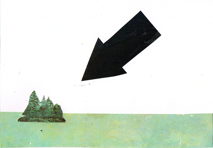
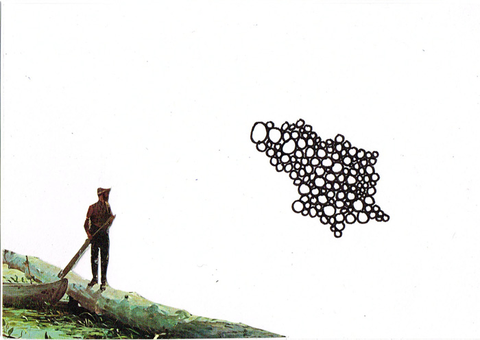
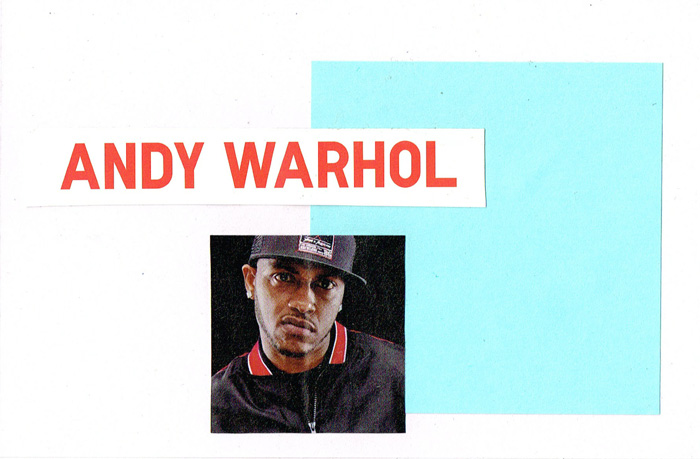
post_islandspoint post_lookatthat post_warholWhat do I do to relax? I make postcards. Not always collage. I find it the perfect format for trying something new in a format that is disposable, easily sent or kept. A pack of 4×6 index cards keeps me occupied for awhile.

Ideal for those who find a sketchbook too much of a commitment.

Against Demons: Summary/Intro

Spent a good swath of today doing the nitty-gritty of soliciting feedback on the first section of the novel. This involved buying $36+ of postage.

Currently calling it Against Demons. I’m 80% sold on keeping that title.

As part of that, I whipped up a spoiler-free written answer to what I always get asked. “What’s it about?” Might make for a nice back of the dust jacket summary, if those things still existed.

    Will Strague is killing time. He goes through the motions of a well-constructed life, tuning his mood with a carefully calibrated diet and chemical intake. He drinks and dates and dresses carefully, showing to all a well-adjusted young man in the perpetual adolescence that is a standard model of modern city life.
But below the surface, he is a cipher. There is nothing there, all avenues of investigation dead-end. Forged addresses, fake IDs, calls that go to voicemail or are answered by paid confederates. In truth, he is not so much killing time as he is waiting for a sign. He is a sleeper with no one left to awake him. One who stays so long is a battle-ready crouch that he begins to grow moss.
The problem is, when you’re waiting for a sign, everything looks like a sign. Things start creeping in: events in the news, bits of overheard conversation, graffiti, error messages, and twists in games that seem more than just games. Things seem to be converging on a moment where action is required. Will gathers his resources and takes stock of the path that led him to here.

The 11 of you who have a copy so far… how close/useful is this description?